Rosa Parks


My artwork consists of a portrait of Rosa Parks and two color tones with the words Resilient underneath the portrait. Some elements that can be seen in my piece are lines, space, and color. I added black lines underneath the head of Rosa Parks to act as the shadow on her neck that is being projected from her head. Two different color tints can also be seen in the photo. I created my art by first isolating the portrait of her in photoshop. I then took that photo and added it to illustrator, which I then used to add the different colors to the portrait. I also added the frame, two toned background, and letters which I got from dafont.com to the photo. I was inspired to do this when I was brainstorming, as black history month was in February. My goal for this piece was to create a portrait of a historic figure to pay tribute to them in regards to black history month. Overall, I enjoyed making this project as I learned how to implement both photoshop and illustrator into one.

Lo-fi Mix

What is the type of business you designed your logo for? Explain

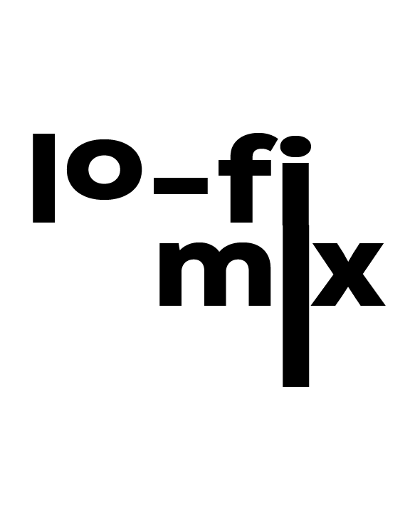
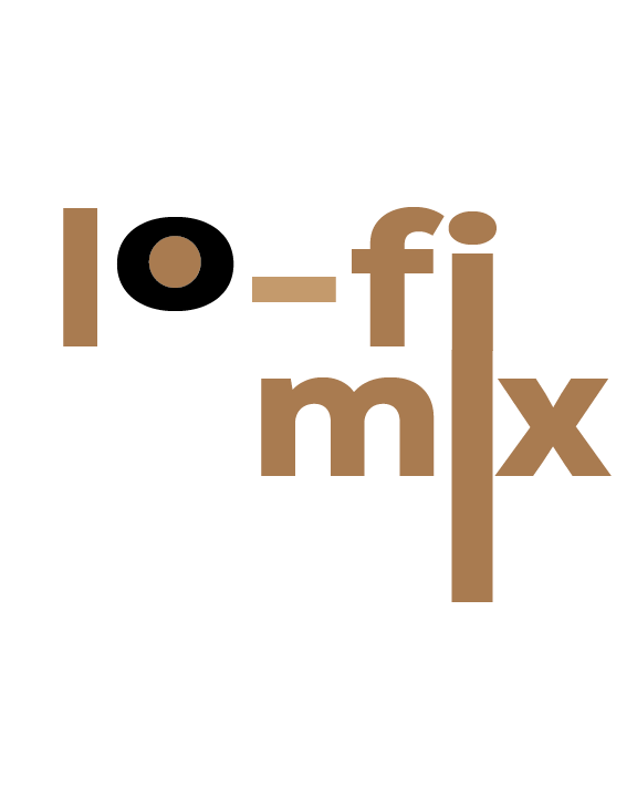
I designed my logo for a new vinyl record store for any audience. I got this idea when I passed by a vinyl store (Hifi Provisions) which had a more modern look to it, appealing to a younger audience. This inspired me to make a logo for a vinyl record business that could appeal to both newer and older hobbyists, containing both more professional equipment as well as more affordable, efficient equipment. I also tried to give it a more modern, minimalistic look to keep it simple and clean, while trying to add personality at the same time.

How does the logo represent your business? Explain.

This logo represents my business, as the word lo-fi is a form of mixing that is affordable, but also creative and imaginative. In my logo, I tried to keep it both simple and creative, which represents both the affordability and creative aspects of the business.

Who is the target audience for your business? Explain.

The target audience of my business is both new and old hobbyists who seek to buy and sell vinyl’s at a reasonable price, as well as equipment such as speakers and record players for any type of budget, which is especially important for newer hobbyists.

How does the logo appeal to that target audience? Explain.

I feel that the logo appeals to the target audience due to how it expresses creativity while keeping it clean, simple, and minimalistic looking. I feel that by keeping it simple, it gives a welcoming feel to newer hobbyists, while still appealing to people who have been in the hobby for a longer time through the creativity of the logo.

What are you the proudest of in this piece of artwork?  Explain.

In my logo, I am mostly proud of how I was able to add character and personality while keeping it simple at the same time. I am also proud of how I was able to connect the two words into one thing by extending the letter I from the first word to the second.

What could you have done better? Explain.

I think that I could have added just a little bit more rather than second guessing myself. While making the logo, I kept deleting and re-adding many different things because I wasn’t sure I liked it or not. I think that because of this, I made the logo a little bit too simple.

The Truman Show


  1. What is the subject of your illustration and why did you choose it? Explain.

The subject of my illustration is Truman as he exits the dome of this fake life and walks into his new one. I chose this illustration because I feel that it is the most emotional/powerful scene in the entire movie. Before he exits the dome, he turns to the camera as he is being broadcasted to the entire world and says the same thing he said at the beginning of the movie, leaving them one final message before bowing and leaving. 


  1. What do you like about your art? Explain.

I like how I was able to replicate the environment around Truman to how it was in the movie. I feel that the clouds help bring together the simplicity of the environment. I also like how I organized the title to fit in and not feel out of place as well. With all these elements combined, I feel that it fully portrays the movie all while being simplistic.


  1. What advice would you give another student before they begin the pictogram technique? Explain.

I would advise another student to really brainstorm and draw out the scenes before they begin, as well as looking through different snapshots of the movie to find the most powerful scene to portray the movie through. I feel that this really helped me, as drawing and mapping out the scene helped me bring my ideas together in illustrator efficiently. Also try not to overcomplicate it, as when I first started, I was focusing too much on the details all while trying to keep it simple which didn’t make any sense.

You Rock


My artwork features a monster truck with stars surrounding both the truck and message. I made it using Adobe Illustrator by first putting a yellow/purple gradient in the background with a purple border surrounding it. I then added purple and yellow stars on the top and bottom part of the card. Afterwards I added the message and duplicated it which I then sent to the background after lowering the opacity, making it purple, and adjusting it to match up with the rest of the message. Once all that was done, I made the monster truck using a picture for reference. The main idea of my card is to express confidence and optimism. This is done by first using the color yellow, which expresses cheerfulness and optimism. Then I used the color purple which expresses confidence and ambition. My goal with this was to make a card that gives the person looking at it confidence and happiness. Overall, I enjoyed making this card, as it allowed me to get comfortable with using Adobe Illustrator which I had never used before.

The Final Four

Pixel Stretch Linear

Pixel Stretch Circular

Bokeh

Neural Filters


1.Which is your favorite photo image that you created? Why? 

My favorite photo image that I created is the bokeh photo. Out of all of these photos, I feel like that photo has the most character to it. I feel like the warm lights contrasts really well with the dark background as well.


2.Which of these image techniques do you think you can apply for future image making? Explain.

I think that the bokeh technique is the most applicable for future image making. You can already see this technique being used in advertisements with it still growing.

Double Exposure

Ram/Oratory Related Double Exposure

For this image, I wanted to combine the Ram statue by De Gaeta with some form of nature that would compliment it. So, after taking the picture of the ram, I took a picture of a tree with red leaves outside Bain by the field. After editing the pictures together in photoshop, it turned out to look great with the ram coming out of the tree with the red leaves complimenting the color tone of the ram. However, the next time I would do this, I would try to fix the photo better in photoshop, as I believe it could have looked better.


Landscape Double Exposure

With this photo, I wanted to take a picture of something with a consistent color scheme and another picture with something to pop out. To do this, I took a picture of some leaves and a tree on the field near De Gaeta, then a tree outside Bain. After using photoshop to edit this, I was pleased with the result. I liked how the bright pink popped out from the rest of the colors in the frame. If I was to do something differently next time, I would probably use a better photo for the flower as it could be seen as too small.


Portrait Double Exposure

With this photo, I wanted to edit something relating to science or nature onto Mr. Seebode’s head. In photoshop. I edited a photo of a landscape onto his head, with the clouds pouring out. If I were to do this differently, I would’ve used a different photo and photoshopped it differently, as there are some imperfections to this photo.

Its Small World

The name of my piece is “Its a Small World” and is meant to show some sort of galactic themed city. First, I took multiple photos of 17 stacks of staples with a plain black background and purple tinted light. After taking these photos, I chose the clearest one and put it in photoshop. I then edited the contrast and brightness and used a cloud brush from a previous assignment to add some sort of a foggy effect to the photo. I then used the warp tool to add a wavy reflection of the staples as seen in the photo. This photo is meant to put a calming mood on the viewer which is the reason why I chose to use a purple tint. I believe that this photo shows the effect photoshop can have, as the original photo was no where near as interesting as the finished product.

Fright Fest

Acrophobia – Fear of Heights


Arachnophobia – Fear of Spiders


Autophobia – Fear of Being Alone


What was the biggest challenge you encountered during this assignment and how did you overcome it?

The biggest challenge I encountered during this assignment was editing the photos. I had the most trouble editing the arachnophobia photo, as I was having trouble properly photoshopping the spider. Whenever I tried to edit the spider into the photo, it would just look out of place due to the brightness/contrast of the spider or because of the shadow I tried adding to it. However, I was able to overcome this with photoshop’s generative ai feature. Using this feature, I was able to highlight certain parts of my spider to either add a shadow or fix the brightness of it to have it match the rest of the photo.


Skip to toolbar